

B2B digital risk assessment application
Project overview
The PwC Digital Trust Manager platform offers self-assessments to determine an organisation’s digital risk profile according to industry standards, and provides risk management solutions. It needed a full review of its outdated user experience and a refresh of the interface.
Project type
Desktop and mobile app, in English and Arabic
My role
UX/UI designer
Industry
Cyber security
Results
Winner of the Good Design Award (category Digital Interface)
The challenge
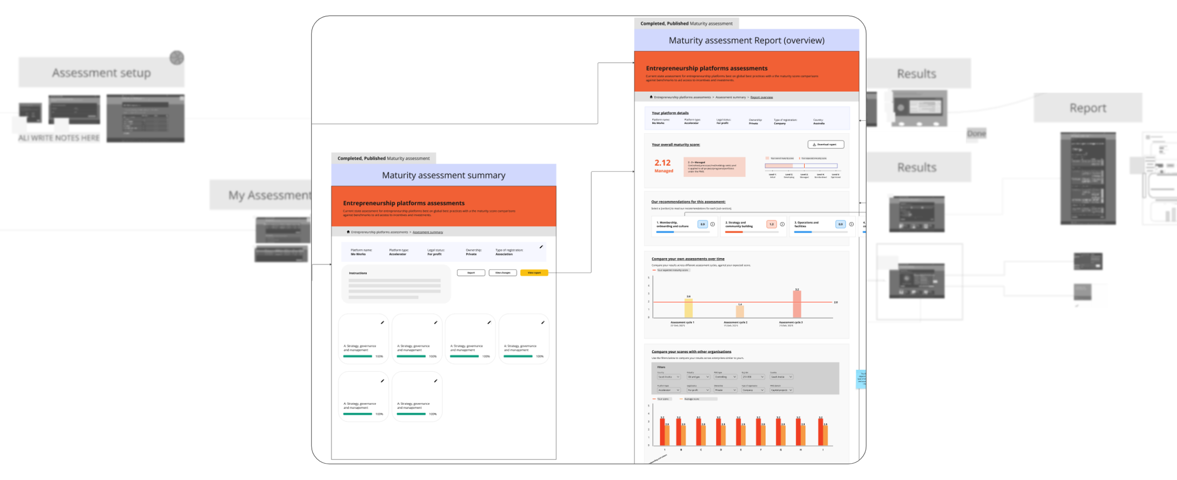
The main challenge was that it had a numerous and complex set of different assessments, each with different question formats, so we had to find a way to unify the whole questionnaire part of the platform.
Each assessment has multi-layered categories and lengthy question sets, meaning we needed to create a superior experience that continually worked to engage the user throughout the process.
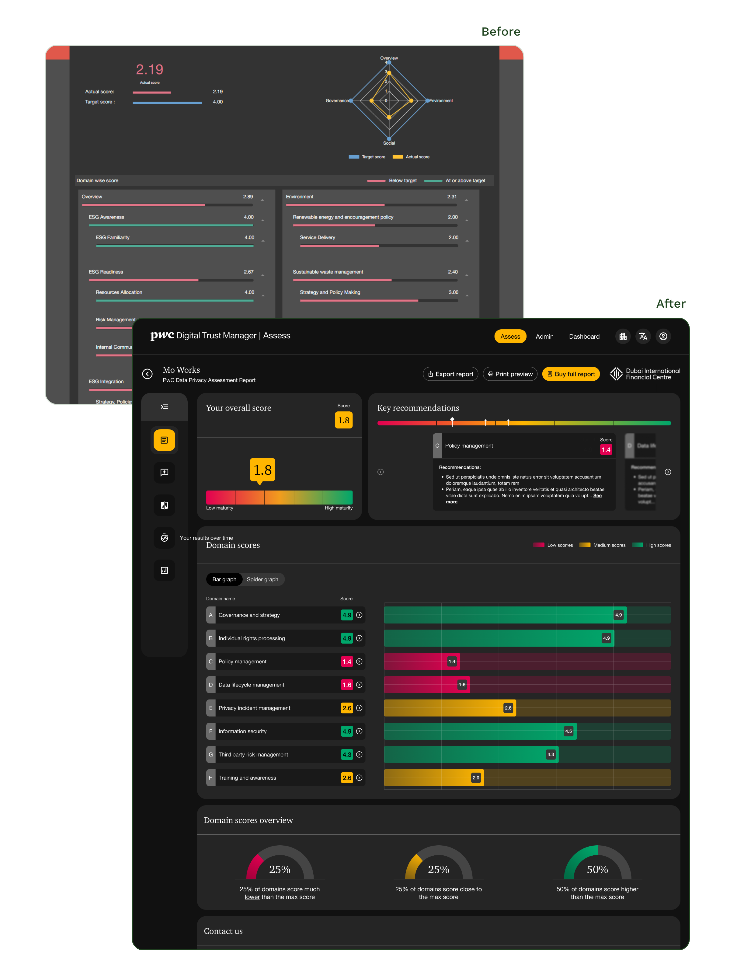
There was also a need for a wide range of infographics to display in a more digestible and visual way the complex data shown on the dashboard and report pages.
Simplify and reorganise
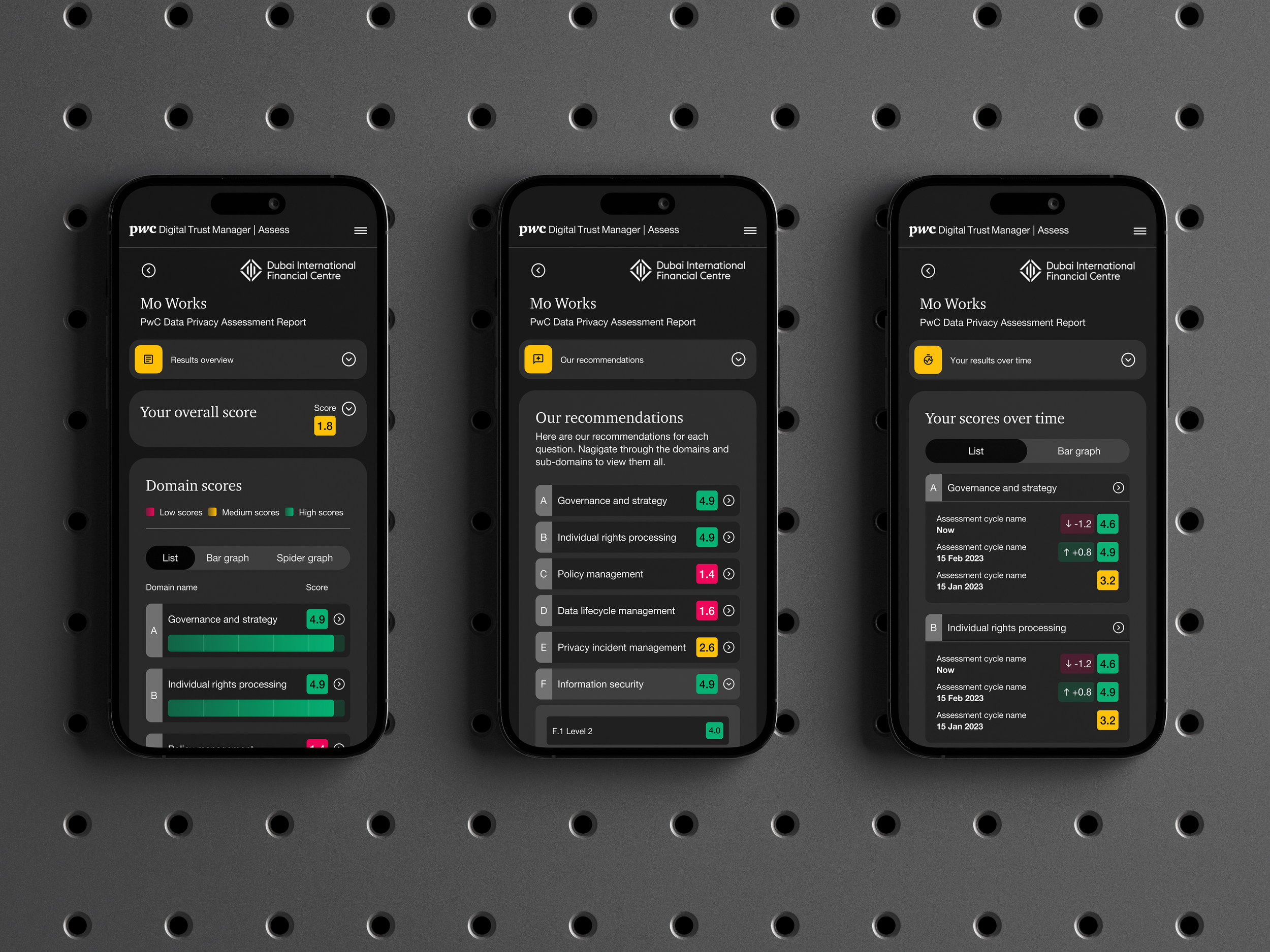
We reviewed every step of the assessments and reorganised the user flows to streamline the whole process. The best way to improve the user experience was to have two experience categories: Assessment, where the user can easily respond to assessment questions, and Report, where the resulting data is presented clearly alongside recommendations for future actions to mitigate identified risks.
The Dashboard is where the user can access all their current and past data, get clear insights on their risk profile and review their tailored advice.
Once the assessments are complete, the data is shown on a report page with an overall score and key recommendations, developed by PwC subject experts. The old platform was making it difficult to get the whole picture in one report and the user had to really search for the information.
The outdated dashboard needed a bit of work to improve how the user can see their current profile and compare it over time.
We improved the graphs and colour-coded the results to give a unified look and quick understanding for the user.
Report pages and dashboard
