

B2B marketing website selling smart parcel lockers solutions
Project overview
This marketing website needed a complete overhaul and redesign, with a UX strategy to align better with their target users.
Project type
End-to-end responsive marketing website
My role
UX/UI designer
Industry
B2B, smart technology
Results
Increased website visits by 56%
Average time on website was up 43%
The challenge
The goal was to review the whole structure of the website to create a more intuitive and user-friendly experience. The client wanted to make sure the new website structure would have an improved user flow from a B2B perspective, aligning with the new user personas and their different needs. It was also essential to adapt the content to accurately portray the business's expertise and review the SEO strategy.
Goals:
focus on a better user flow from a B2B perspective
review, update and optimise the content
improve SEO indexing to enhance online visibility
refresh the UI to better align with current branding
UX research: sitemap analysis
I started the research stage by thoroughly analysing the current sitemap, going through each webpage and identifying strengths and gaps in the current UX/UI as well as the content structure and the website performance. This gave me clear insights as to what we can keep, improve, or remove in the next stage, as well as what is missing. These are the findings I used to create a Value Proposition Canvas, highlighting the gain creators, and pain relievers from my analysis.
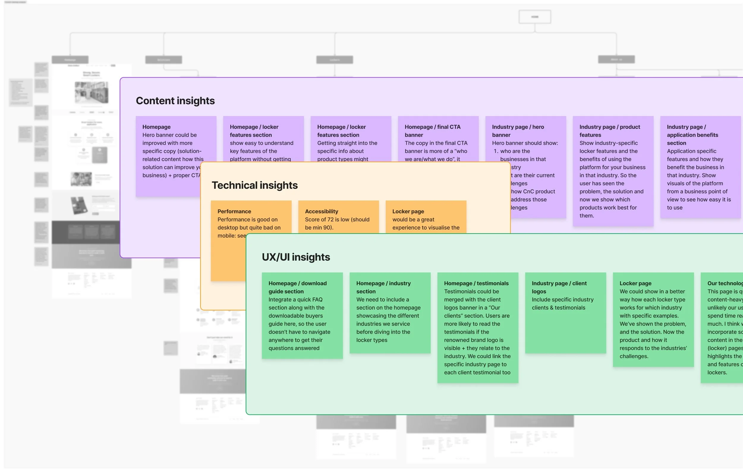
Sitemap analysis with insights on what to keep, add, remove, or improve.
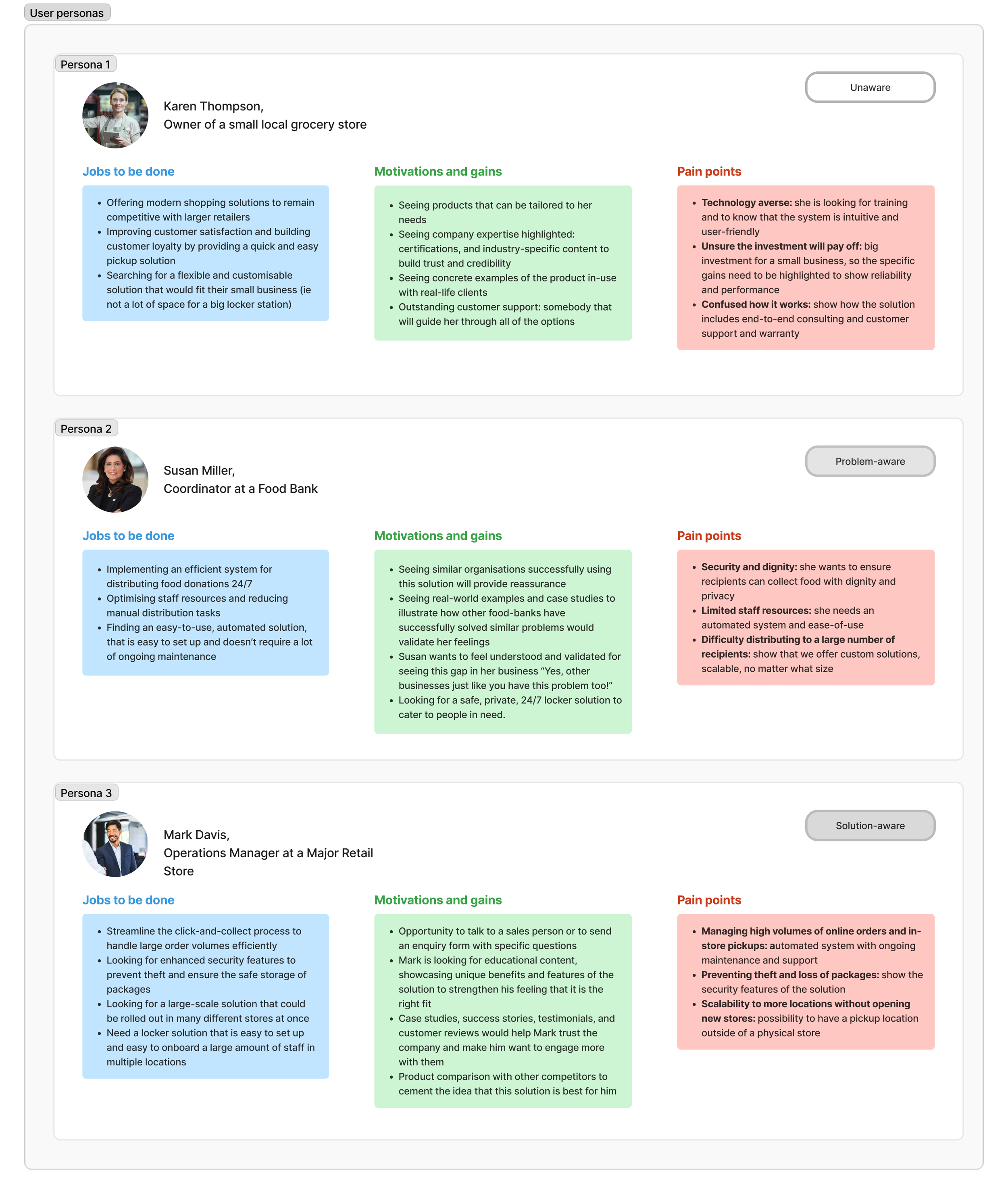
UX research: User personas
The competitor analysis I conducted studied eight of the client’s biggest competitors globally. I analysed their site-wide content structure, various user journeys, UI and overall performance, which enabled me to draw some key takeaways (what they have in common, what to avoid, things to improve etc).
I then moved on to the user persona phase of the research, which was done based on the customer-awareness stages: unaware, solution-aware, problem-aware, product-aware, most aware.

Low fidelity wireframes
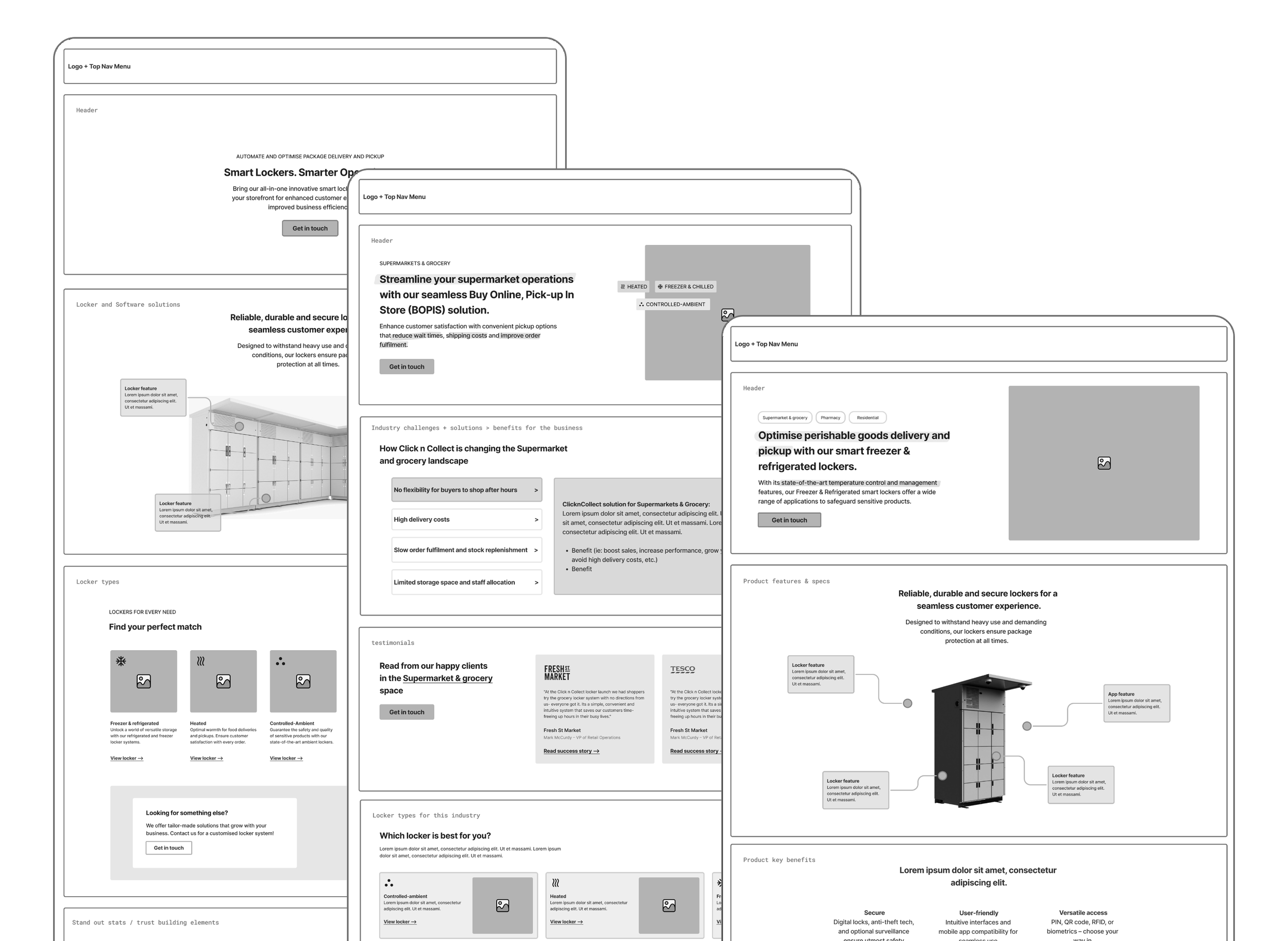
The user persona analysis gave me the foundation to create different customer journey flows based on how each user would land on the website page, whether it was through a google search of certain keywords, clicking on a blog article, social media post etc., and deciding how to take them to the information they’re looking for in the most seamless way.
Once that was established, I moved on to create the low-fidelity wireframes in parallel with the content structure and SEO strategy.
UI design

